Depending on their intended target audience, distribution companies can choose from a wide variety of platforms to market their product. There is a range of places to advertise, such as TV, Radio, print, posters, billboards, social media, product placement, etc., however only some of these can be applicable to the target audience. Despite this, it is important to advertise over many platforms, as it is not guaranteed that someone who watches TV will see the advert, for example. Social media advertising is growing rapidly as the use of sites like Facebook, Twitter and Instagram is increasing daily as access to these technologies improves. Facebook has 1.5 billion active users alone which provides a seemingly endless platform on which the distributor can promote the product. As it is primarily younger people who use Facebook (though there is a growing contingent of middle aged and elderly individuals), this would be a good place to advertise to that particular age group. Audience feedback and research are vital here, as the company needs to know where to spend money on the advertising and promotion in order to have the largest possible reach. Audience feedback can provide information on the most popular media that they use and therefore boost the appeal of the film, which would improve reviews over social media and other web 2.0 technologies and therefore reach a wider audience.
A film which recently innovated and looked for an inventive way to market itself was the action-comedy Deadpool. Every week leading up to the release, the company would produce a poster parodying another film, or by playing off the reader's pragmatic understanding that Deadpool was a comedy and had no relevance to the posters whatsoever This would mean the reader is employing Norman Fairclough's theory of members resources.


Many of the viewers who see these posters will understand the reference and find them humourous, therefore leaving those who understand it holding a positive view of the movie and could possibly recommend it to their friends. This caused a large reaction on social media, with the images receiving thousands of likes and shares on Facebook and receiving attention on aggregator sites like Reddit. This advertising campaign would have been considered a success, as the film took $132,434,649 in its opening weekend was screened in 3558 theaters in the US - more than Avatar.
Another film which enjoyed success following an extensive advertising campaign was The Woman in Black. The distribution company marketed it well, and used the household name of Daniel Radcliffe to their advantage, which attracts a large portion of his fans from the Harry Potter series. What is unique is that they appealed to all kinds of audiences during their marketing campaign. They advertised through media such as Facebook and Twitter to attract younger viewers, while also appealing to an older audience by advertising during prime-time TV shows. They also placed advertisements in newspapers in order to appeal to the older, more educated audience. Billboards were also used in addition to bus stops and on trains.
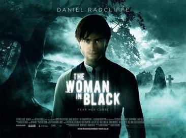


There are many differences between the two sets of posters. In the Deadpool posters, they focus on the humourous, colourful nature of the poster, whereas in The Woman in Black posters, there is a distinct lack of colour beside the focus of an eerie blue. The overall tone of the two connotes the genres of each. It is clear that the Woman in Black is a horror and that Deadpool is a superhero comedy through the use of imagery, for example in the last three posters, there is a ghostly figure who we assume to be the woman, whereas in the first three, the main character appears to be messing around, suggesting, the tone of the film to the reader. The marketing campaign could also be considered a success, making $20,874,072 in its opening weekend.
When it comes to promotional products, keeping a unified brand identity is important as it allows the reader to be able to recognise the product. For example, in the Woman in Black, though Daniel Radcliffe is the protagonist, it is actually the antagonist that appears in all the products, which provides a sense of mystery and uncertainty and entices the reader into buying it. I feel I have kept a strong brand identity throughout my texts as I have used similar colours, lighting and effects on all of my texts. This includes a consistent logo in and the same red, black and white colour scheme.
No comments:
Post a Comment